This website uses cookies so that we can provide you with the best user experience possible. Cookie information is stored in your browser and performs functions such as recognising you when you return to our website and helping our team to understand which sections of the website you find most interesting and useful.
The rebranding of Homestories
Outubro, 2022
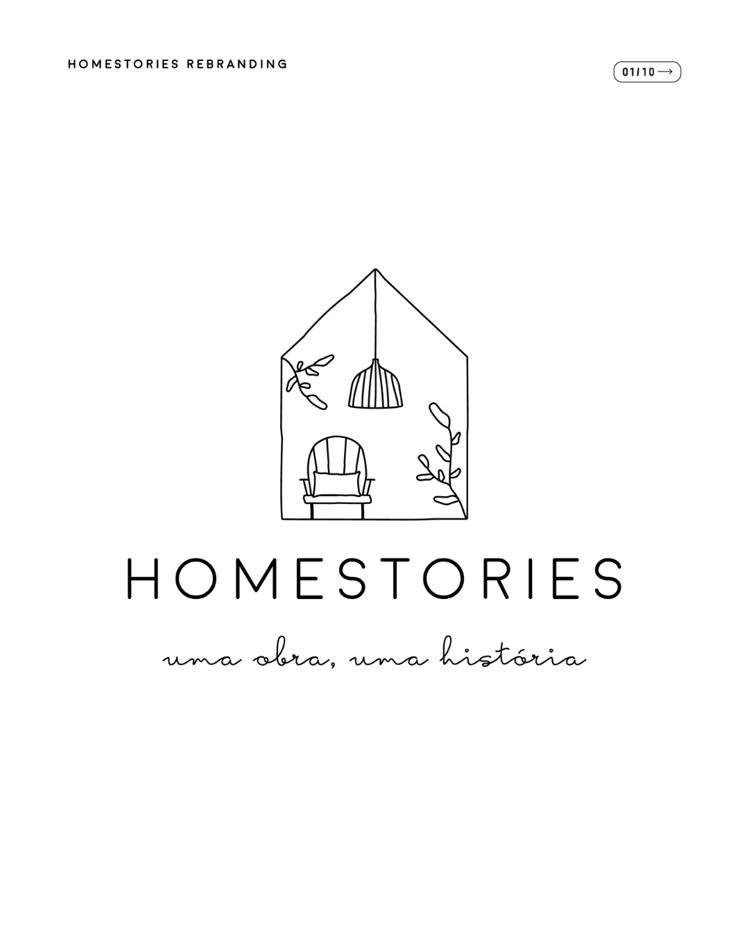
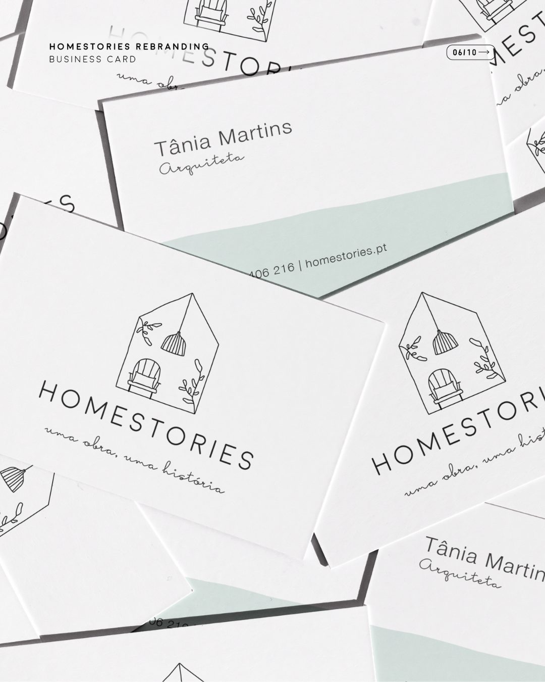
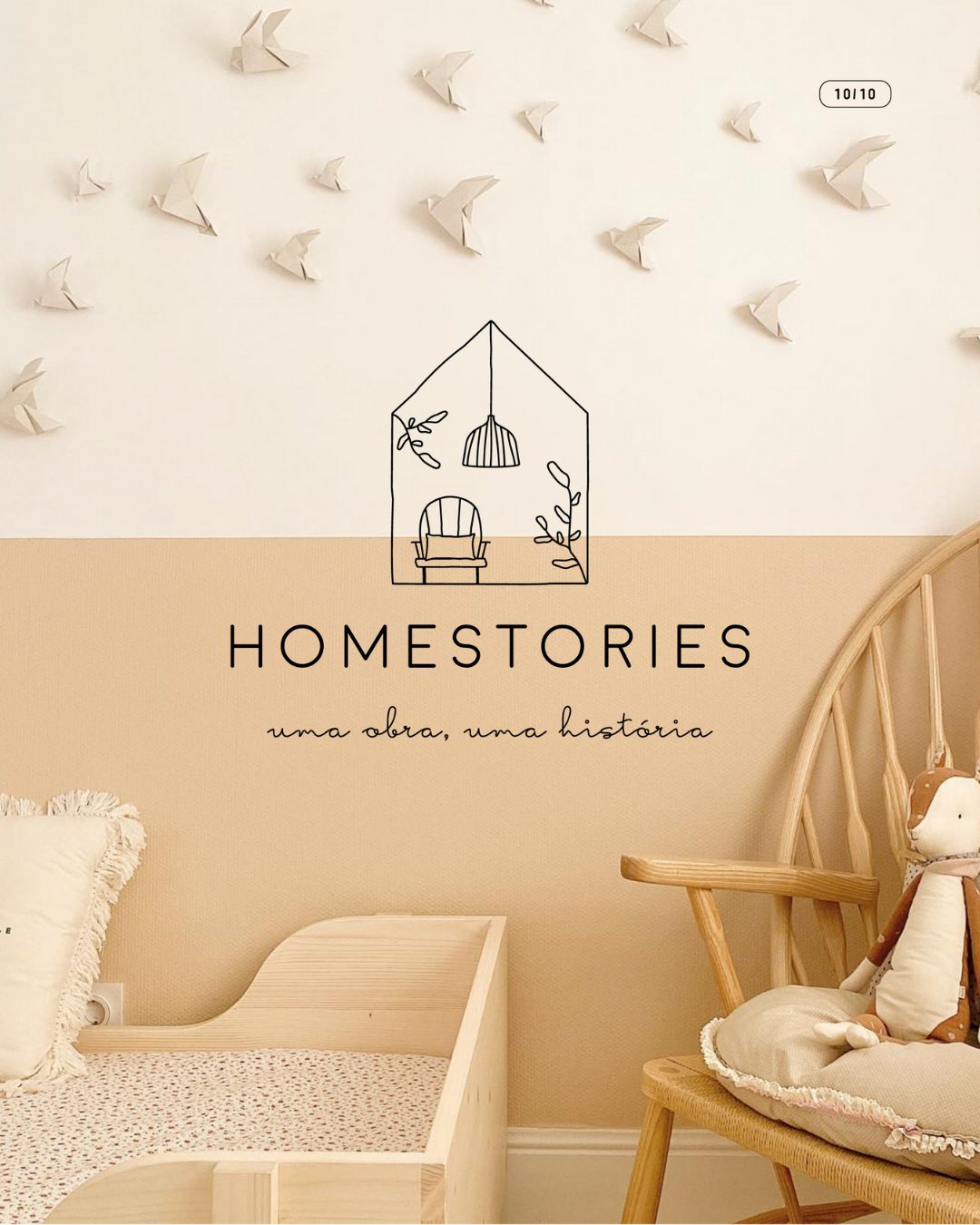
The change in our image began when my friend Raquel told me she would love to create a new image for Homestories. She challenged me with something I wasn’t expecting, and I confessed that I had some apprehension. This is because creating a logo is a difficult process for me, maybe because I come from an artistic background or because it’s something personal, and I find it challenging to like and identify with an image that will say so much about my work and me.
But if it was going to be done, it would be with Raquel, one of the most sensitive and delicate people I know, so I placed all my trust in her. There was only one requirement: to maintain the house shape!
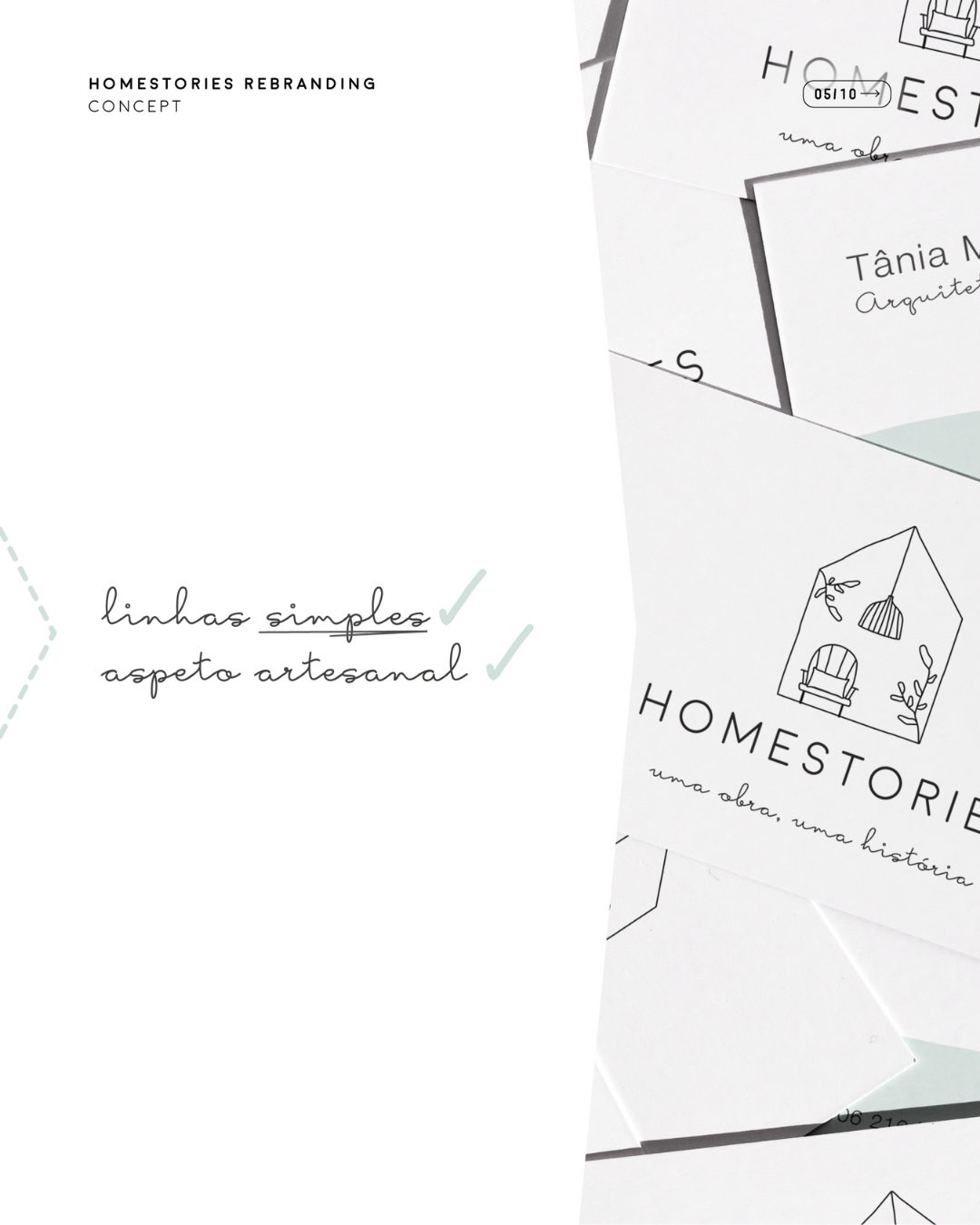
In our first meeting, we talked about the brand, how I see it, and how I think our clients see it, and the basic idea I had for this change: a logo with a simple, somewhat raw, and minimalist line.
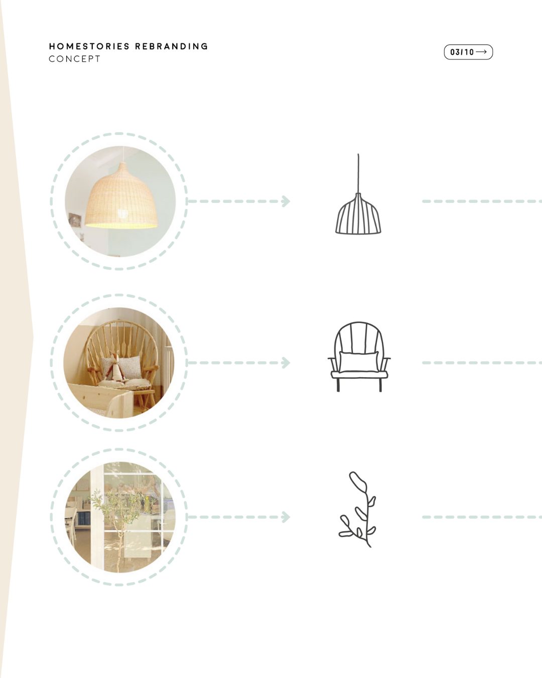
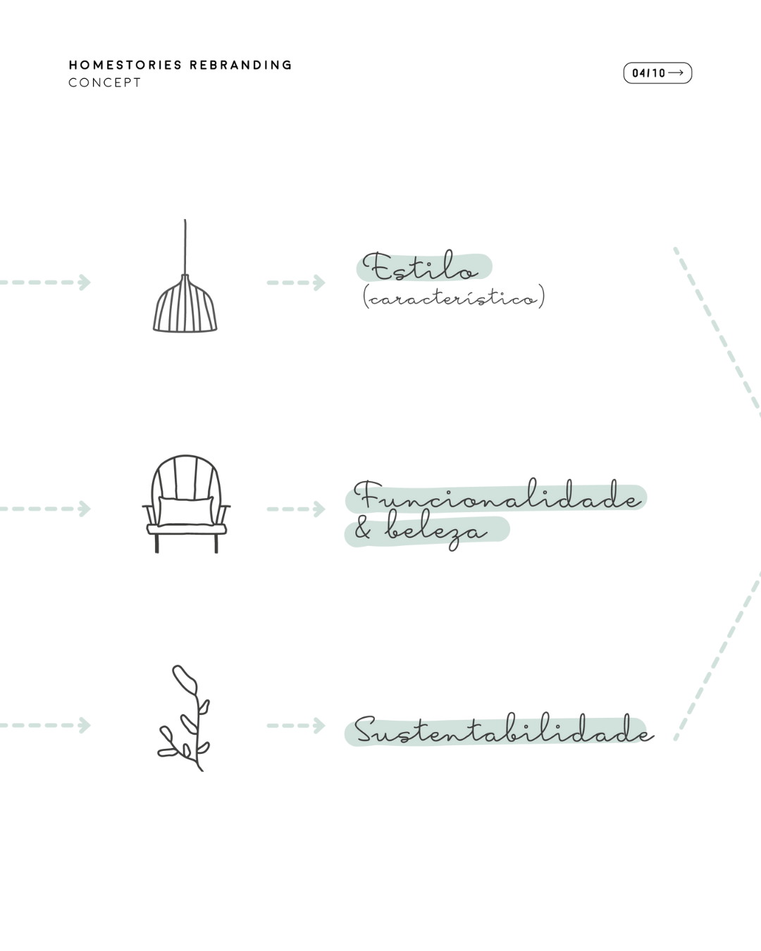
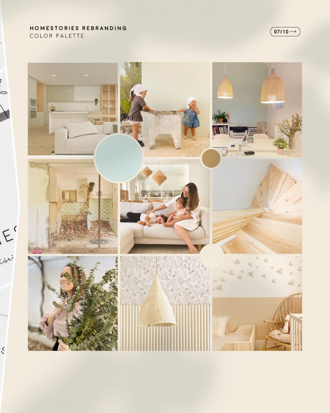
In the next meeting, it was Raquel who, in a few words, presented Homestories just as I see it: a brand with its own identity and style that is common to all its projects; a brand that primarily focuses on functionality while still emphasizing aesthetics and values every detail; a brand that cares about the environment and sees architecture as a way to make our homes more practical and sustainable.
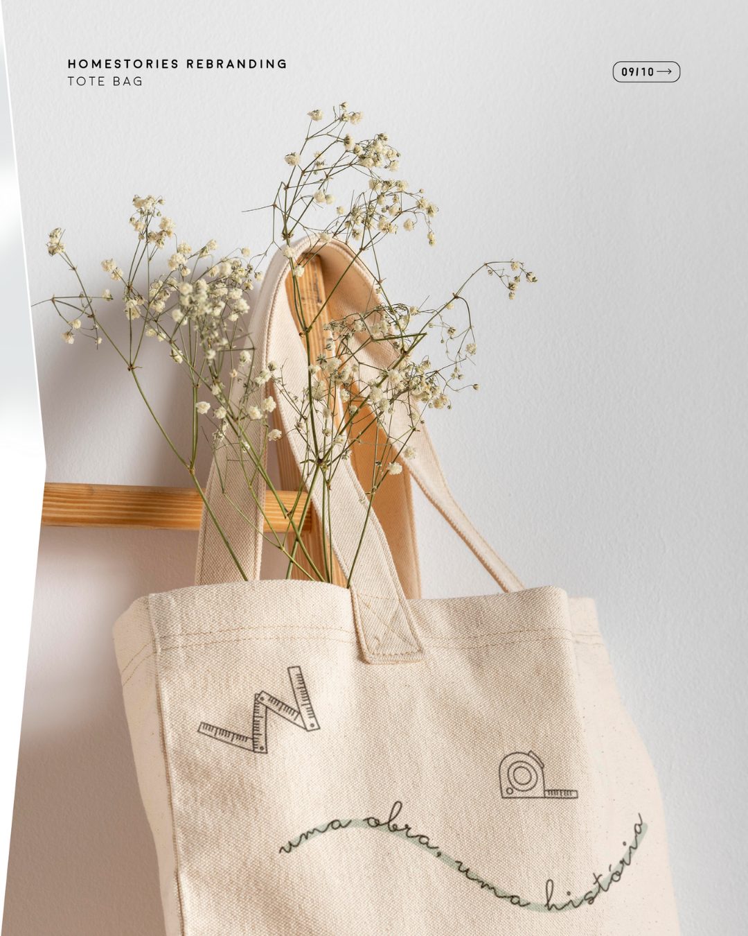
Starting from there and associating these words with decorative elements that characterize our projects, Raquel came up with a proposal that I immediately fell in love with. We made only minor adjustments and arrived at the final version.
It was a process that I loved because Raquel has an incredible working method and a great insight and sensitivity to understand us! I truly believe that only she could have achieved this result with which I identify so much. So, I couldn’t help but thank her for all the care, time, and dedication she put into our rebranding!
If you are looking for someone to take care of your brand’s branding, you have to check out Raquel’s work!
https://raquelmalveirodesign.com/

